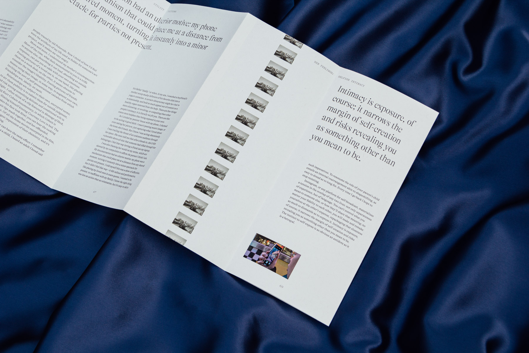
Utility is a print magazine about our relationship to images in contemporary visual culture.
Thinking about “fictions”, Utility looks at the way images are used to tell the stories that actively shape the world we live in today. The issue focuses on three articles: the life of digital images, queer cinema, and intimacy in an internet age. Inspired by the movement and malleability of cinema, the magazine takes on a continuous accordion fold to create a reading experience that experiments with how image and text can interact with physical form.
2020
Publication
Editorial
Curation
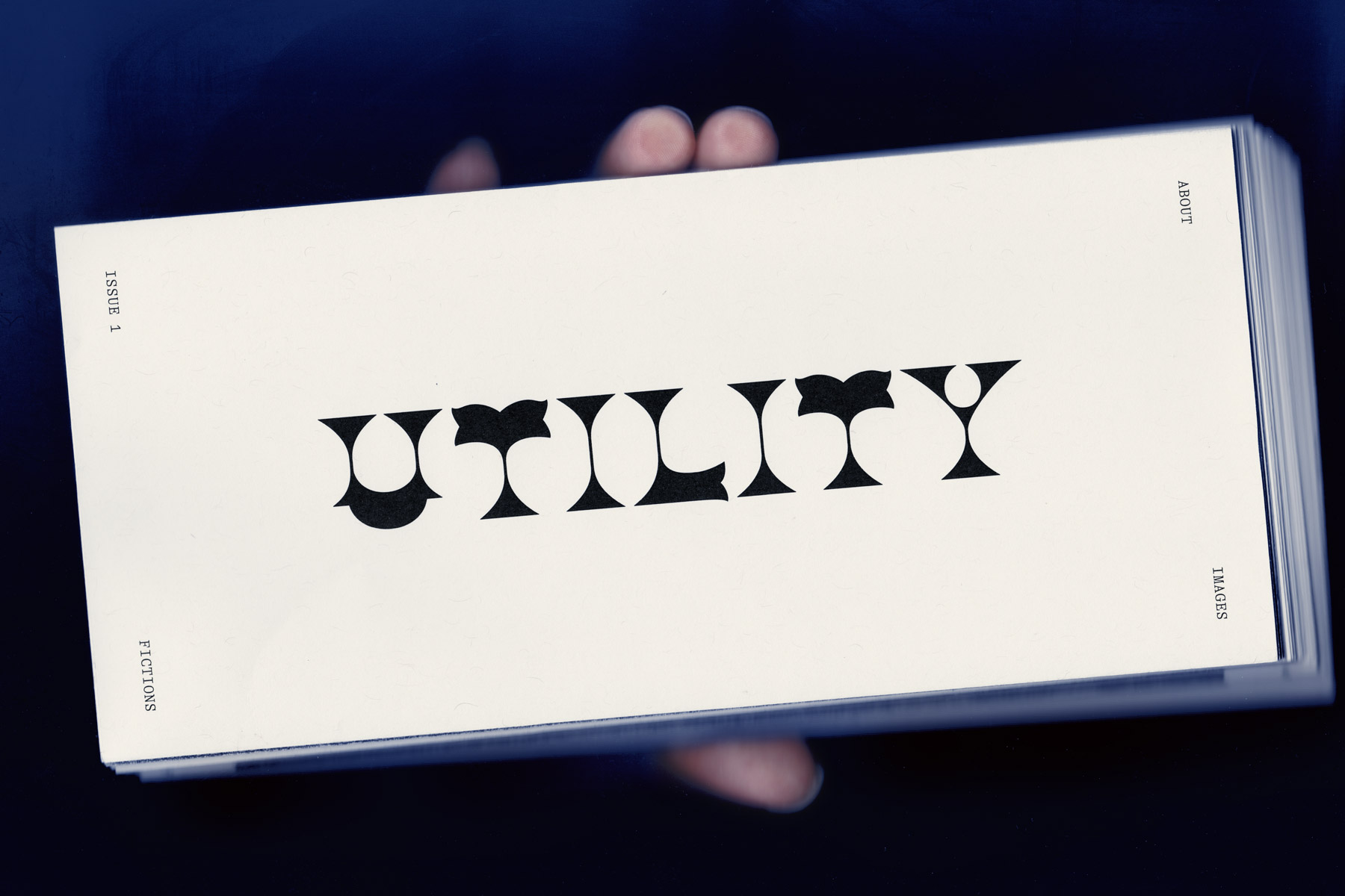
Custom wordmark based off of Wells & Webb’s Gothic Tuscan Italian.
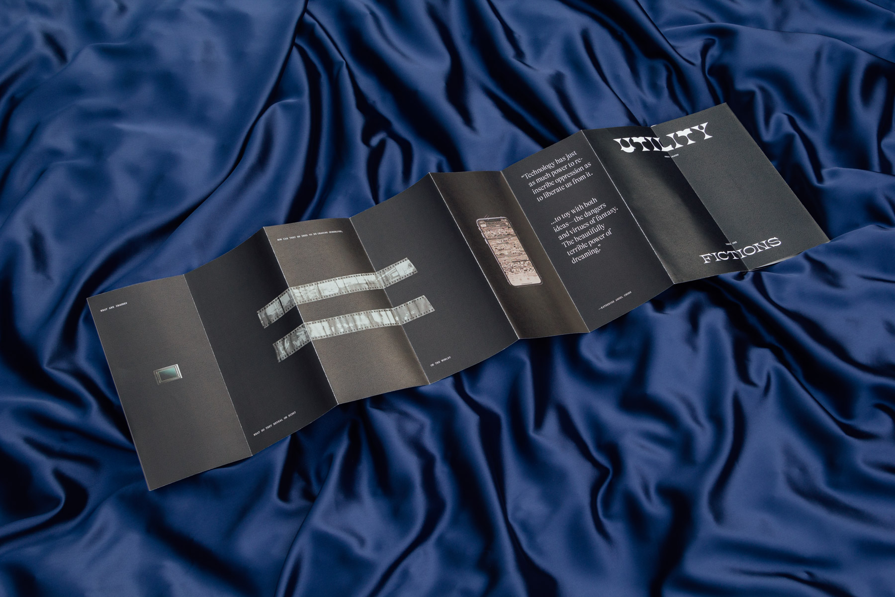
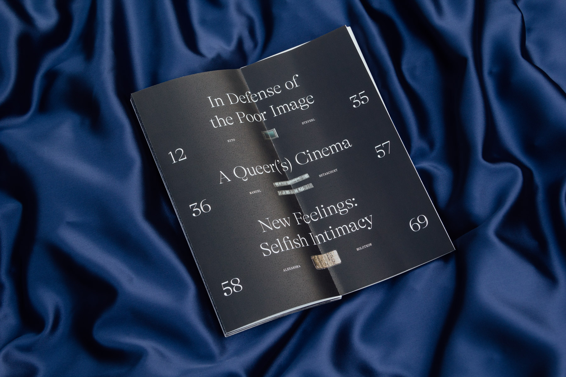
Playing with form, on the page and as an object
Within each article, image layout and art direction reflect the text’s specific focus and perspective around images. In the first, images gradually form, degrade, and kaleidoscopically spread; in the second, images are larger than life and expansive; and in the third, images vertically scroll along its panels, interacting with onlookers.
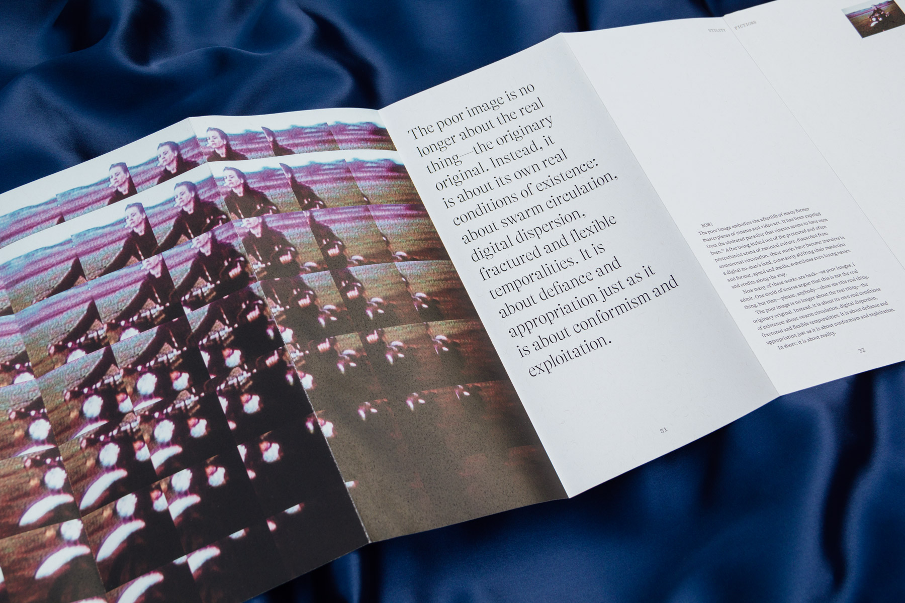
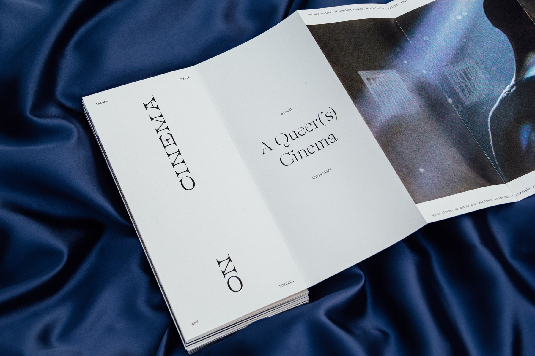
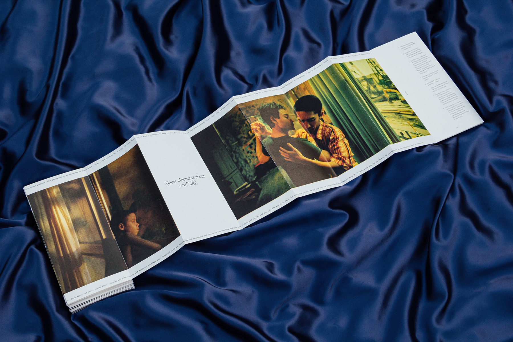
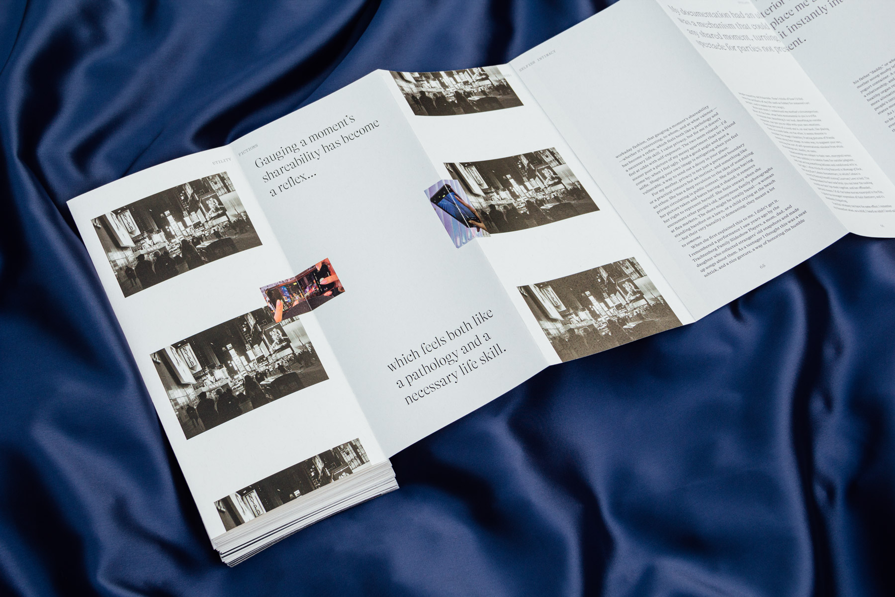
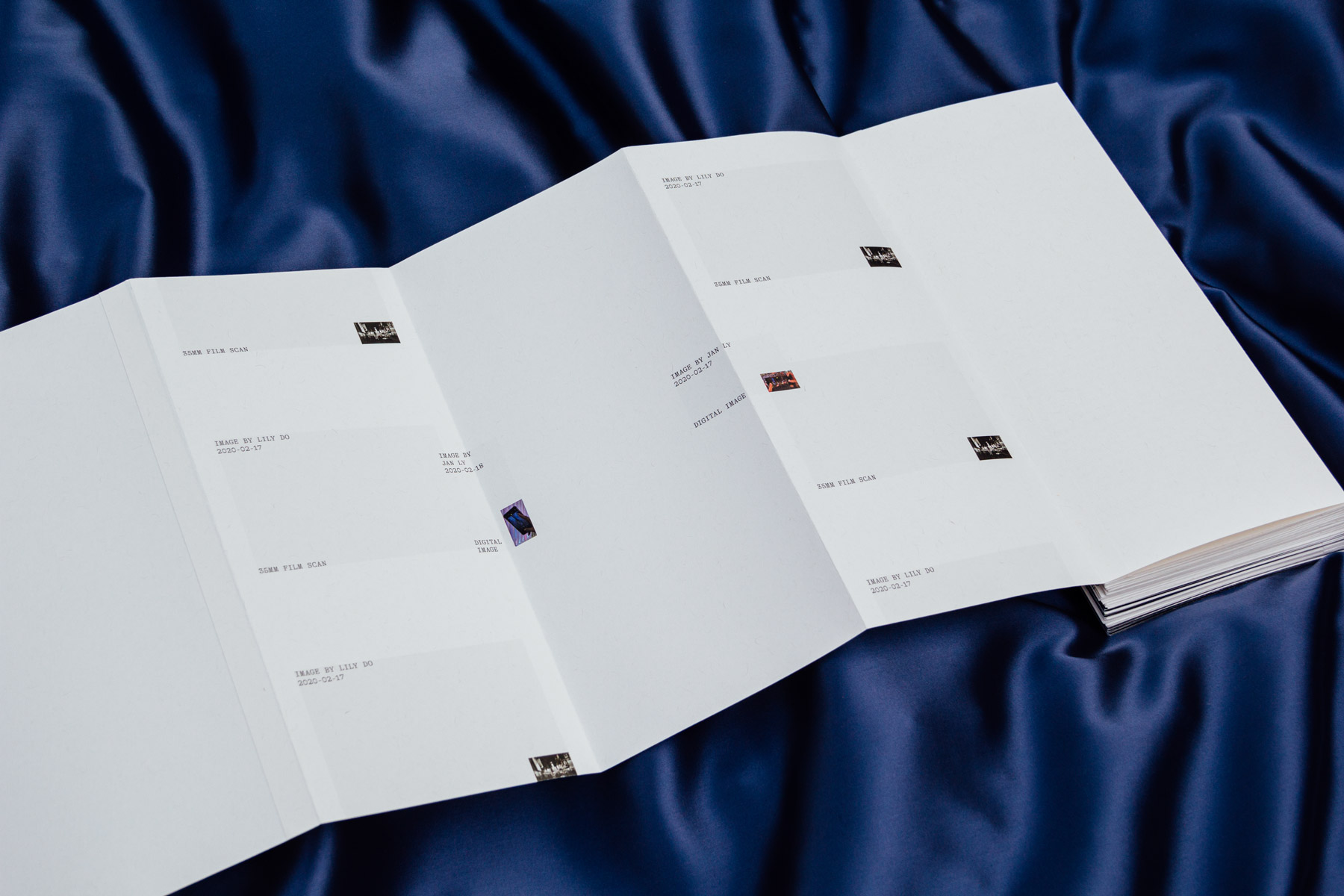
Front and back sides of the same spread. Image credits are placed directly behind each respective image.
