The Office for Postal Arts
Publication
Identity
Art Direction
Imagemaking
2024 – ongoing
The Office for Postal Arts is a publication series for correspondence and mail art. Its root comes from zinemaking, a pastime habit of sending friends elaborate mail, and a playful take on personal “correspondence”. As an ongoing project, it acts as a framework for me to experiment with print media, various methods of image making, process, intuition, narrative, and meaning. There are currently two public releases — all named by date — documented below.
Issue 2026.08.20
Issue 2024.04.21
Issue 2026.08.20
2026
12 pages
350x500mm
Endorse folded (to 350x250mm)
Digital print
55gsm improved newsprint
Edition of 30
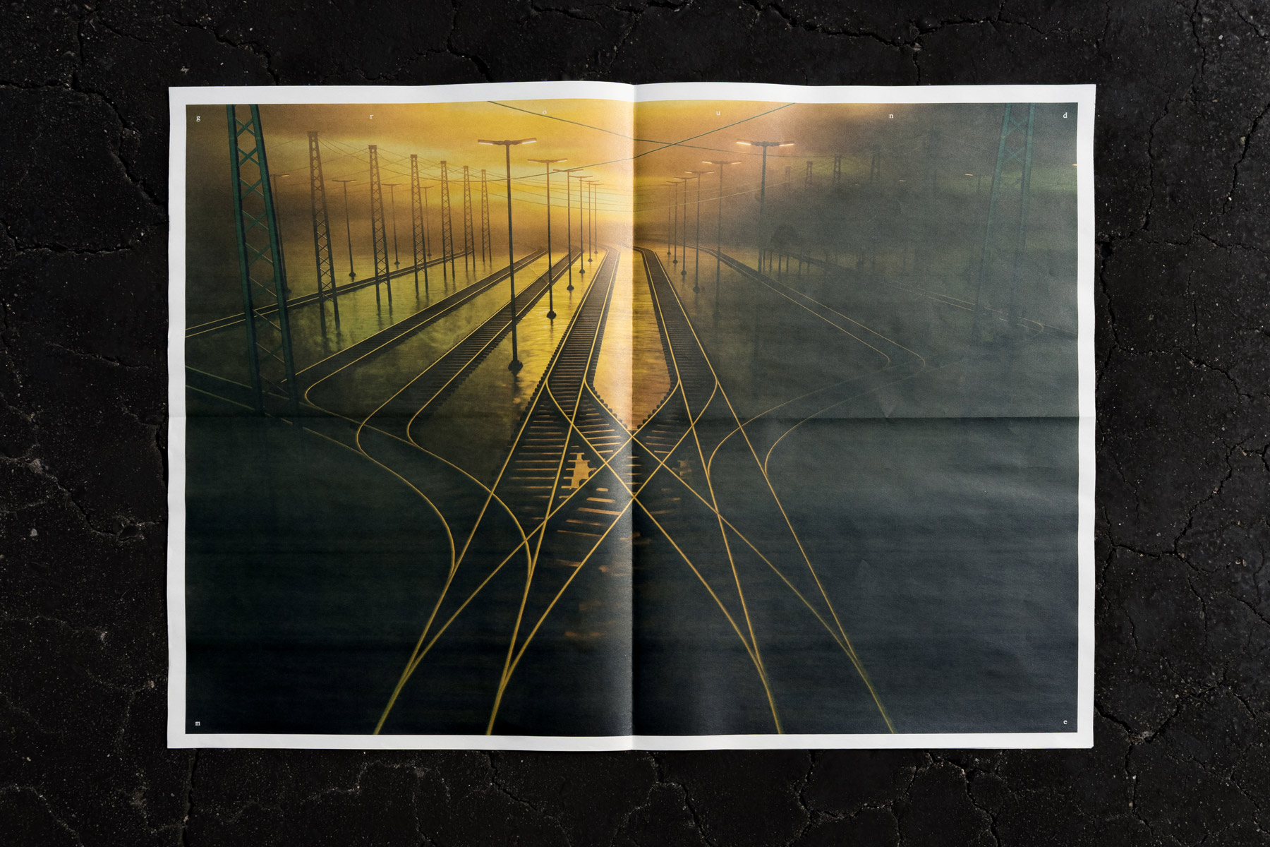
This issue is dated for 2026.08.20, and is about Mark. They are the world traveller: obsessed with train routes infinitely connected, metal rails, and power lines — an industrial constellation of light and power. Following a loose narrative of a daydream on a train, the broadsheet features a sequence of film stills, digital artwork, photographs, and text across its large pages. With a symmetrical structure, the publication also forms into new image pairs and full spread 500x700mm posters when unfolded.
More documentation coming soon!
● Available in the shop
Issue 2024.04.21
2024
95x203mm
6 pieces (multiple dimensions) in die-cut envelope
Digital & inkjet print
Varied Edition of 20
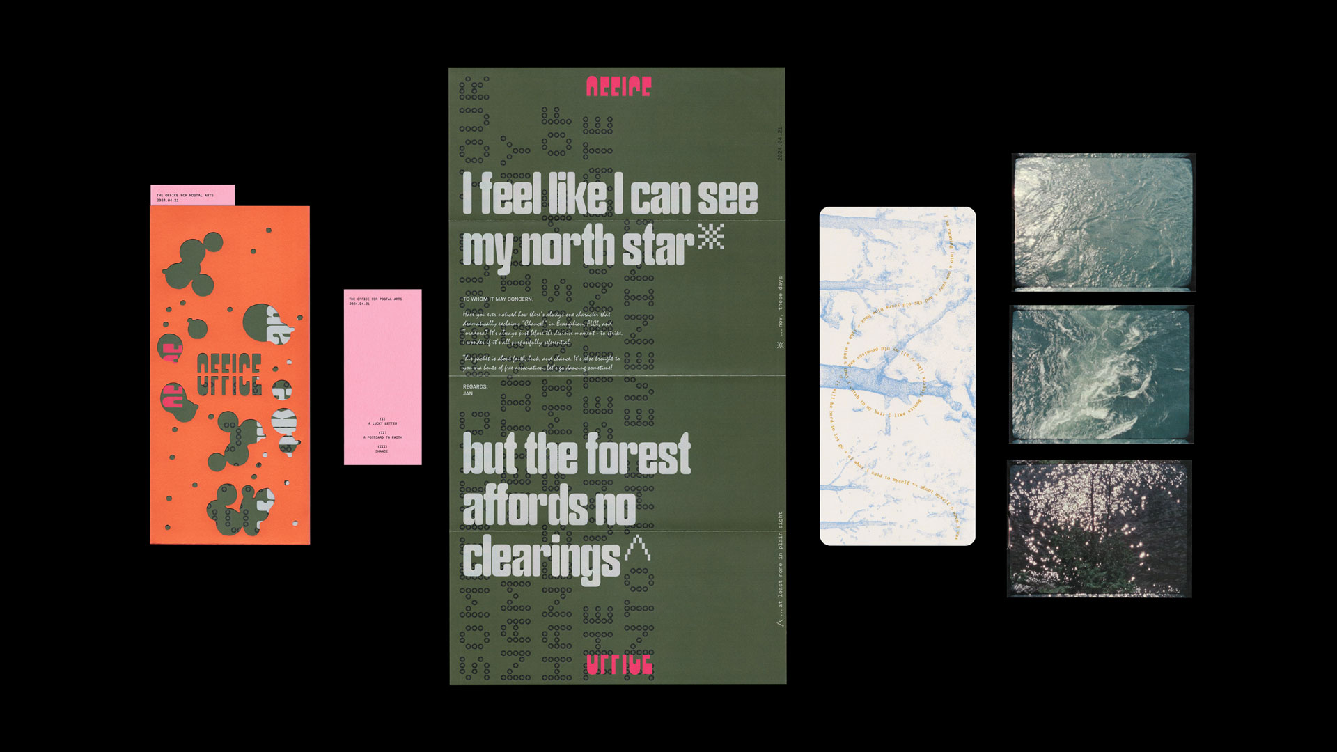
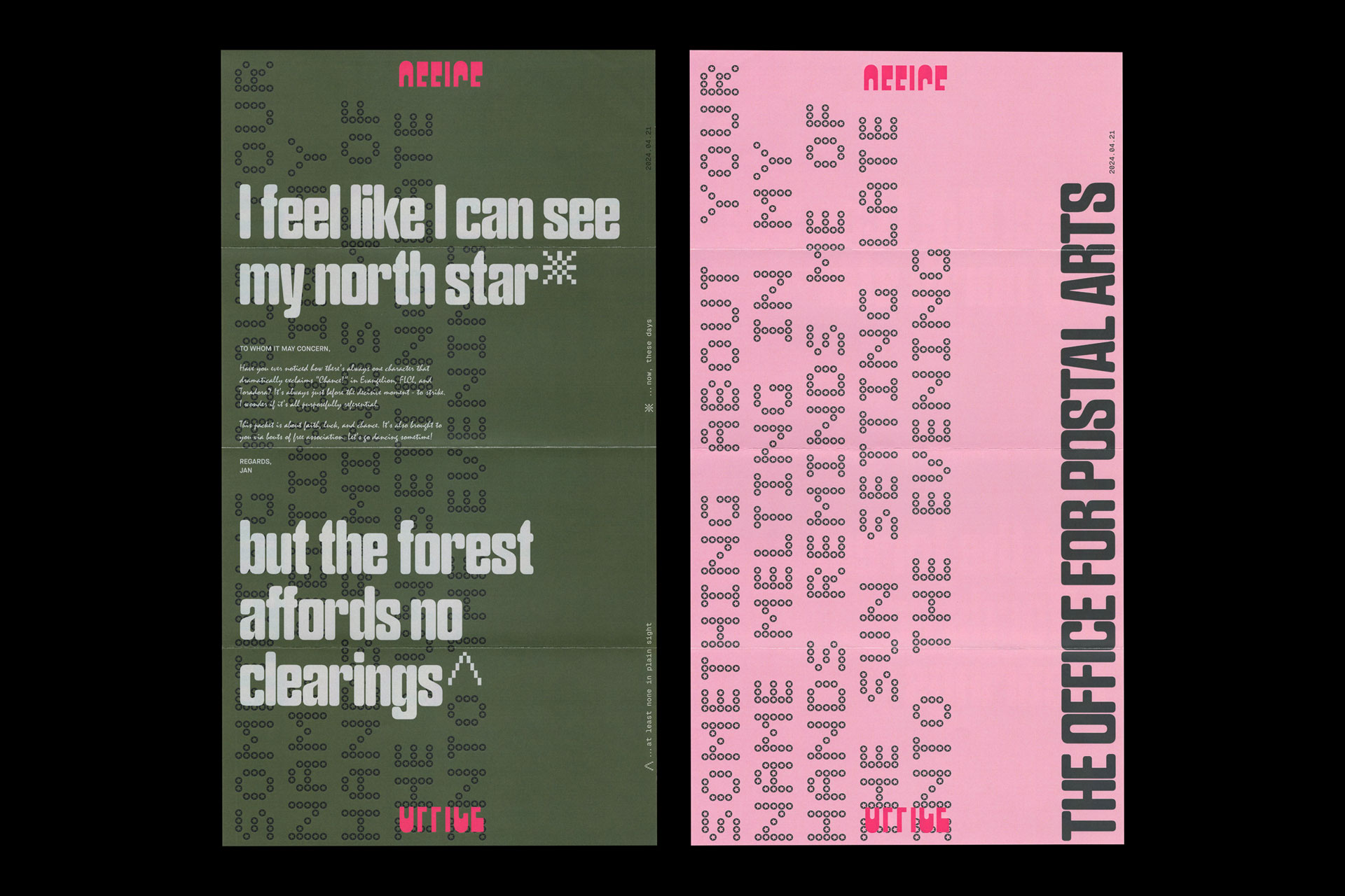
Dated for 2024.04.21, this publicly inaugural issue of The Office for Postal Arts is centered around faith, luck, and chance. Building the groundwork of this imaginary institution, the graphic abstraction, branded photo prints, freewritten letterhead, and poetic postcard all attempt to grapple with the idea of correspondence in a zone somewhere between formality and candidness. The publication and all its contents are designed to neatly fit inside a standard #10 envelope.
● Available in the shop
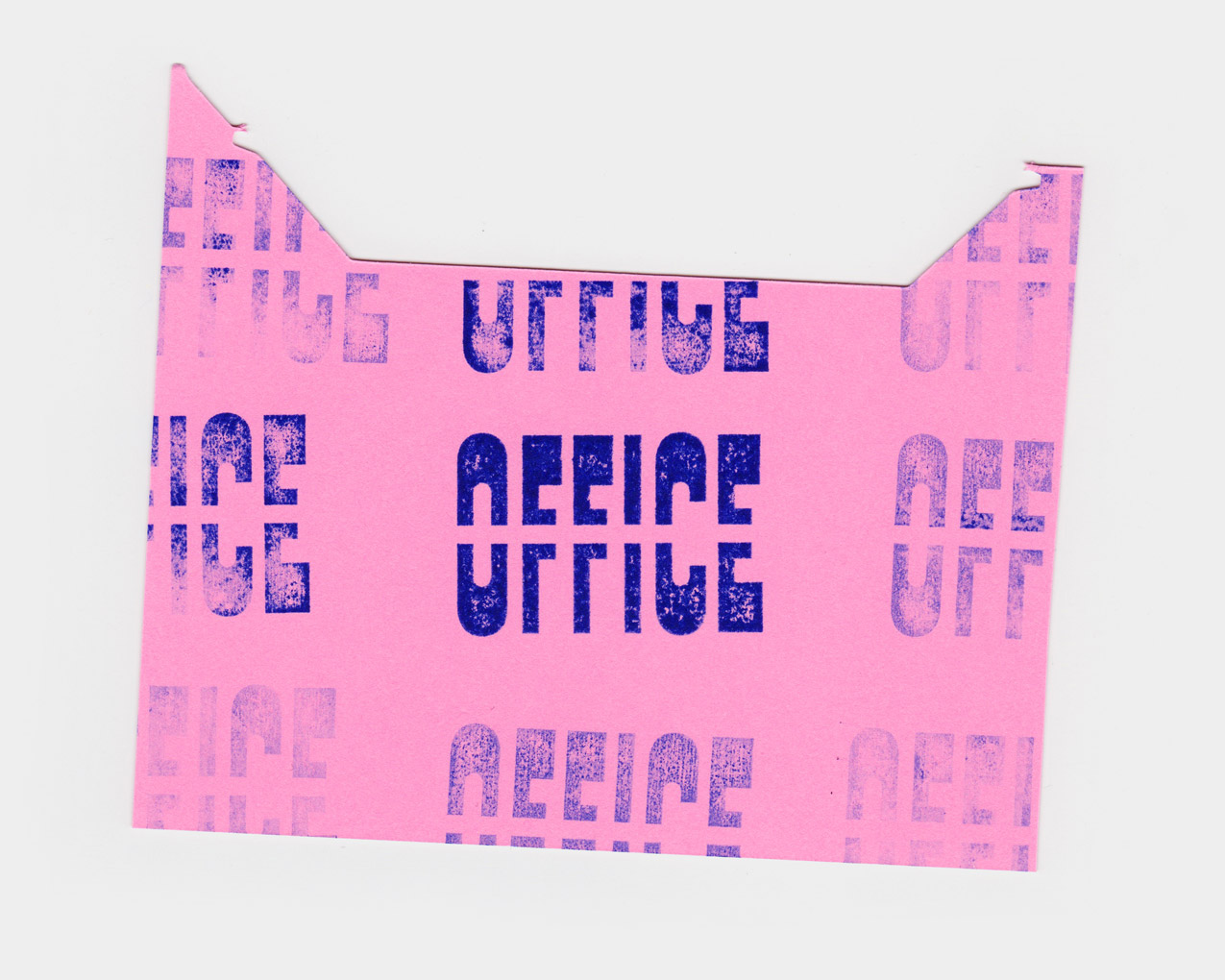
A Postal Cancellation
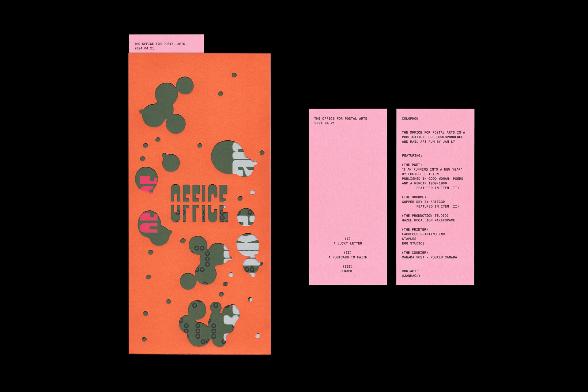
The wordmark acts as an entry point into the publication, as both a title and a graphic motif that’s repeated and broken apart throughout the project. Designed with stenciling in mind so that it could be die-cut into the cover, the stern and industrial letterforms spelling out “office” effectively receive a strikethrough. As a guiding metaphor, the rest of the publication similarly explores tone of voice by creating conflicts between formality and candidness.
The project’s form of delivery informs its thematic interests and design — drawing on values from the mail art tradition. Playing with the context of common commercial mail formats, printed correspondence in an internet age, and formats like postcards that encourage further re-distribution were all ideas I was interested in during the creation of this project.
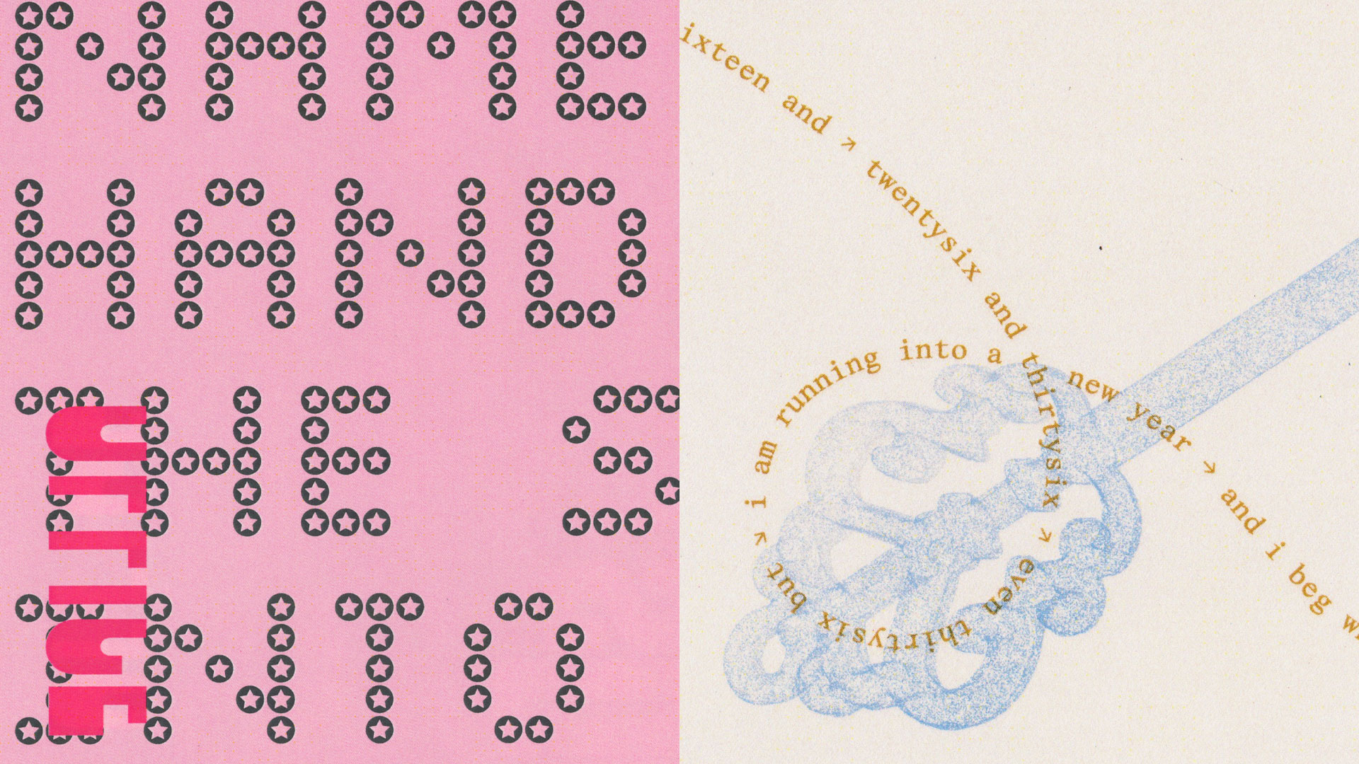
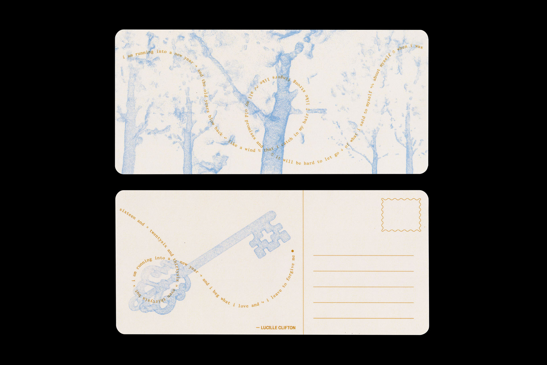
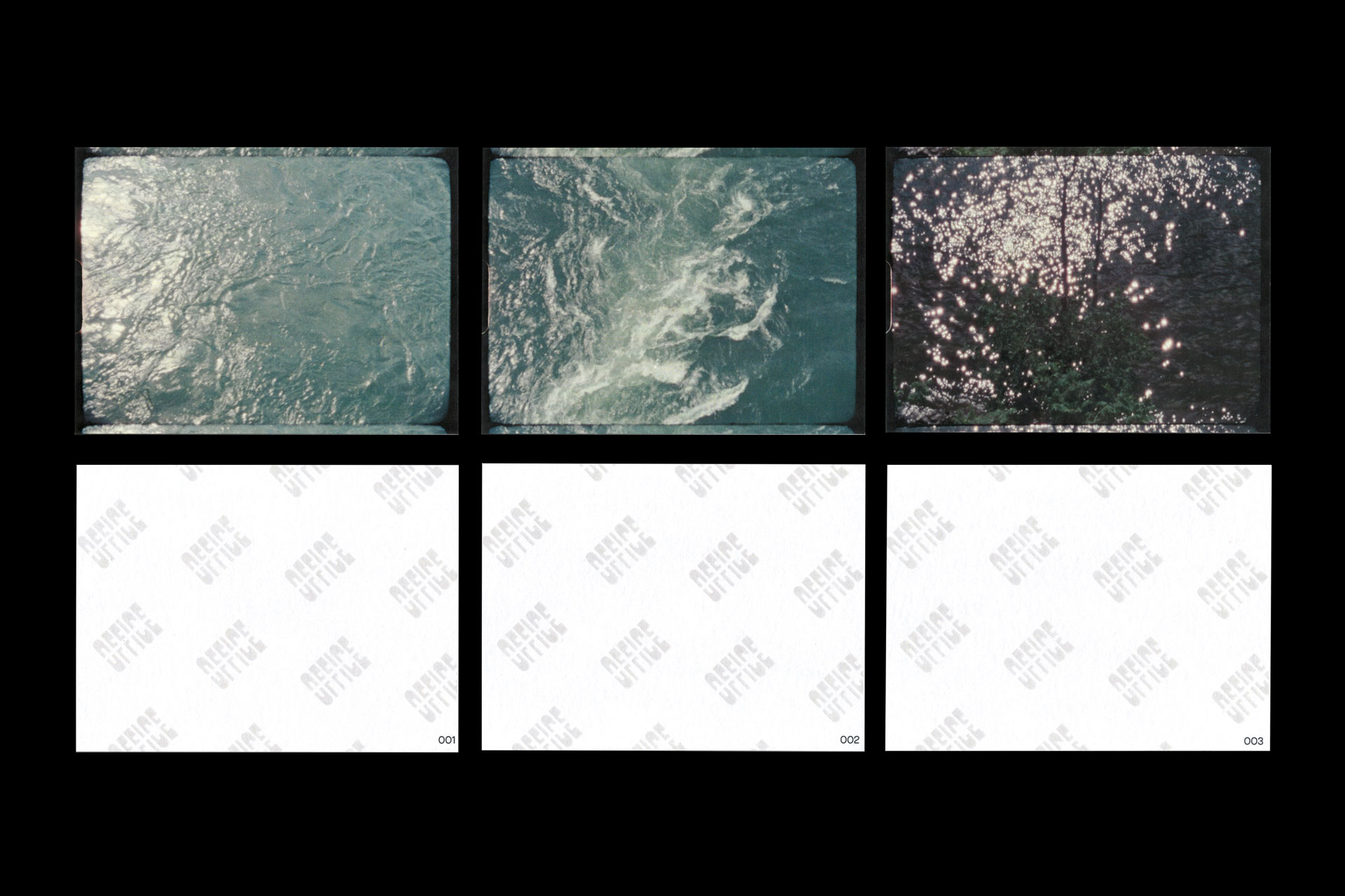
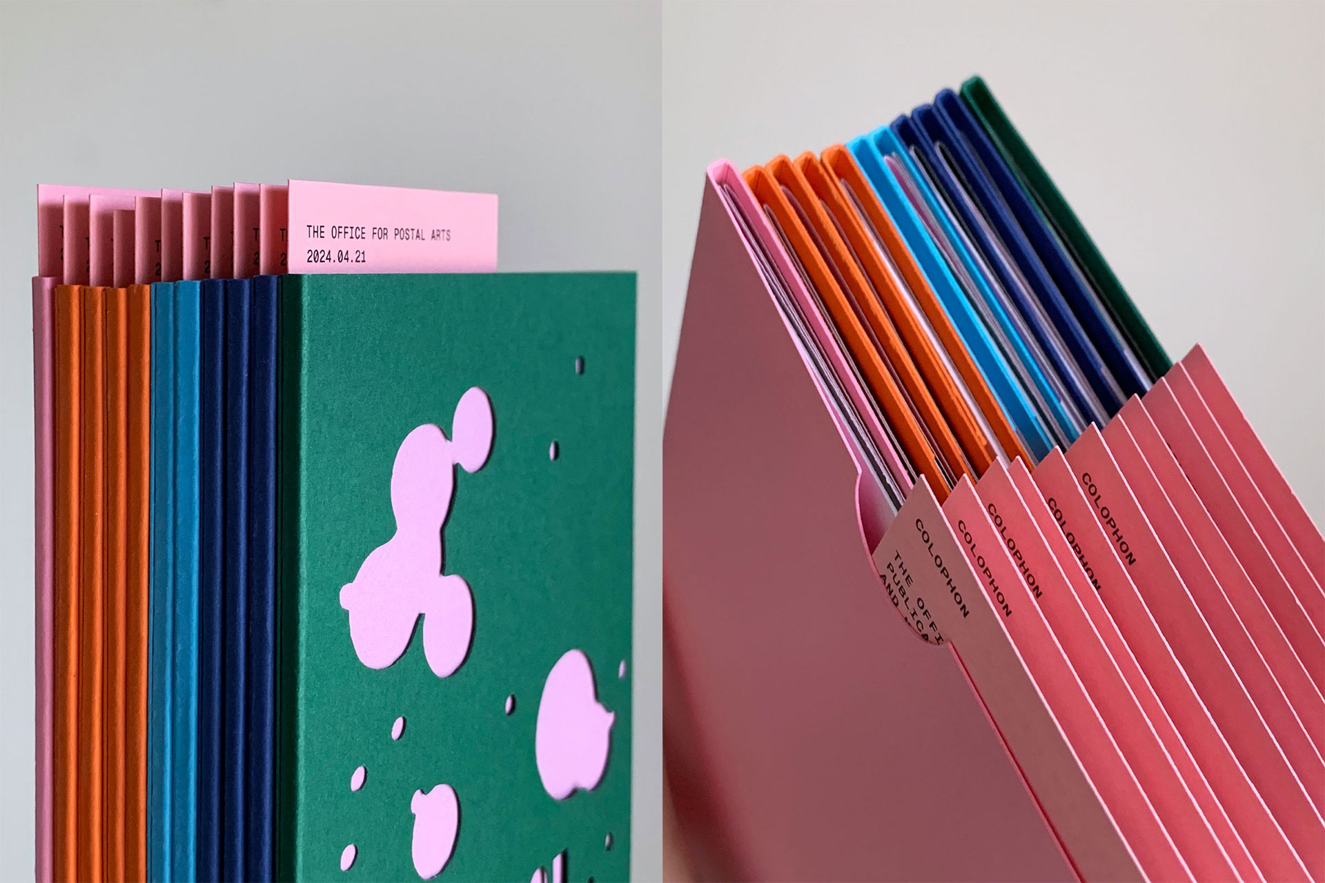
The publication was produced and assembled in multiple colour variants on the occasion of its inclusion in Zine Shine 2024!